Top Ten Tuesday: The Evolution of Books Covers
1. Pride and Prejudice... so many to choose from now.
3. The Hobbit... can you believe how ugly the original book was? But why not feature an actual hobbit?
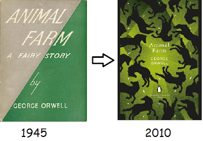
4. Animal Farm...A Fairy Story? Really? Notice that part of the title is dropped.
5.To Kill a Mockingbird...the original cover is still available, too.
6. A Clockwork Orange...I don't like either of the covers or the book.
7. A Wrinkle in Time...I think the version I read the first time had a creepy, Sci-Fi cover.
8. Slaughterhouse-Five...I don't think either of these covers capture the message of the book.
9. Harry Potter and the Sorcerer's Stone...I love every edition.
-Anne


Ooh The Hobbit- fun! And yes isn't it funny how some covers really change?
ReplyDeleteInteresting to see how covers change over time.
ReplyDeleteMy TTT: https://jjbookblog.wordpress.com/2020/09/15/top-ten-tuesday-281/
I'm glad they kept Peter Rabbit more or less the same. :)
ReplyDeleteMy post .
It's interesting how little Peter Rabbit has changed.
ReplyDeleteGreat take on this week's topic! I love really old books like the first Pride and Prejudice. I don't have any that are quite that old though. Here is my Here is our Top Ten Tuesday.
ReplyDeleteThese are fun, and I remember several of the original covers.
ReplyDeleteI like to see the evolution of covers. Some are so trendy though they couldn't possibly last more than a decade.
DeleteWhat a super fun way to do this week's TTT! I have to admit, I think the modern day version of A Wrinkle in Time is a huge improvement over the old one. :D
ReplyDeleteOooh! Great list! It's great seeing how each covers have evolved over the years!
ReplyDeleteHere’s my TTT!
Ronyell @ Rabbit Ears Book Blog
It's fascinating to see how the covers have changed over the years. Most of the old books I see at antique shows have little on the front covers. I was surprised to find that that is the norm in France, too.
ReplyDeleteCool spin on the topic! Wow, The Hobbit cover was ugly. I’m glad that one got a redesign.
ReplyDeleteAj @ Read All The Things!
I tend to like the version that I've read. I like the original of both HP and To Kill a Mockingbird
ReplyDeleteI really like the newer A Wrinkle in Time edition, but maybe that's because that's the edition I read.
ReplyDelete