Top Ten Tuesday: These are really terrible covers of famous classic novels. They all seem to miss the mark on so many levels...themes, aesthetics, general appeal, you name it.
 |
Frankenstein by Mary Shelley, Barnes and Noble Classics, 2005. Okay, I take it the monster had teeth but is that the main point of his creation?
|
 |
To Kill a Mockingbird by Harper Lee, Heinemann Educational Books, LTD., 1966. Was this the school version used by students in the 1960s? Where are Scout, Jem, and Bo Radley?
|
 |
The Woman in White by Wilkie Collins, CreateSpace Publishing, 2009. Way too modern for the story and why is someone self-publishing this book which is still in print?
|
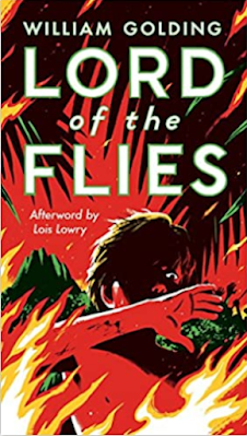 |
Lord of the Flies by William Golding, Mass Market Publishing, 2003. The cover conveys chaos, but what is that brown beaver-looking thing in the middle? Ugly.
|
 |
The Hound of the Baskervilles by Sir Arthur Conan Doyle; Penguin Classics, 2009. The cover isn't ugly, it just doesn't seem to have anything to do with the story. Odd.
|
 |
Of Mice and Men by John Steinbeck. Penguin Classics, 2000. Upsetting and ugly. I couldn't read this version of the story because of the cover.
|
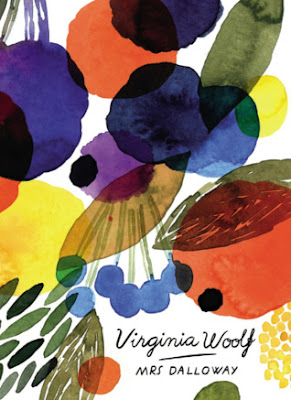 |
Mrs. Dalloway by Virginia Woolf, Vintage Classics, 2016. Weirdly colorful and cheery, which doesn't seem to match the story at all. Perhaps because the book begins with the purchase of flowers?
|
 |
The Picture of Dorian Gray by Oscar Wilde, Modern Library Classics, 2004. The placement of the book's title is so odd. Why is it placed right over his head?
|
 |
A Midsummer Night's Dream by William Shakespeare, Public Domain Books, 1998. What the heck is this supposed to be? It is so weird it makes me laugh.
|
 |
Dracula by Bram Stoker, Oxford University Press, 2011. Um, isn't this the wrong monster?
|
-Anne


No comments:
Post a Comment
I look forward to your comments and interactions! Join in the conversation.